
Making data available and accessible is an important part of public sector engagement and transparency. Initiatives such as data.gov.au and other open data portals provide an avenue for the public to engage with government and better understand policies and practices of government.
Or do they?
Data by itself provides limited value to the public. Expertise is required to interpret and gain understanding from it. As the size of the data increases, so does the level of expertise required to understand it.
To be truly transparent and engage the public on an issue, releasing data alone is not the answer. And nor is a media release telling the public what they should know. The public are increasingly skeptical about “facts” released as the selection of data can create a skewed view.
Providing an avenue to interact and engage with a data is an important part of public sector engagement. It gives an opportunity to communicate the purpose and impact of government policy and programs. And using Tableau software to support this is just good business.
The data communication strategy

The strategy for data communication is a modification of the data-driven journalism process. It has four steps, and as we step through them information becomes accessible and increases in value to the public and organisation.
Communicating data begins with the identification and discovery of data within the organisation.
The filter phase sees data cleaned, prepared and analysed, with data linked for additional context or aggregated to maintain privacy.
The visualisation phase is where the means and methods of displaying the data are selected. Software is important – but so is the choice of chart, graphics, map, table and interactive text to display.
Through this process of preparing, filtering, analysing and visualising the data, key stories or pieces of information will have been identified. At this stage, the focus can be narrowed to one or more key stories to tell and we communicate insights to the public and encourage them to interact further with the data to discover how it relates to their world.
When should the data communications strategy be used?
The time it takes to prepare data, visualise it, select a story to communicate and go through the various channels of internal review and approval means that the process may not be fast or easy. With the time and effort that may be required, it is important that the resulting products are impactful.
Providing data and an interactive visualisation with every publication may see it loose its impact and value in the eyes of the public. It is important to be selective for greater effect. But communicating data is important to educate on the impact of changing policies or the effect that have had – any contentious issue where the public want to know “what’s in it for me?”
Expanding upon storytelling
The audience for a public sector engagement strategy is diverse – highly educated professionals, blue collar workers, migrants and elderly, just to name a few. Their experiences and opinions on government and policies differ. But they all have the right to be able to understand how government impact their lives on their own terms.
And it is important they are engaged in the story being told through data and it means something to them.
Bringing it home is important – and this means using interactive tools to drill into the data by location, demographics and other categories that help personalise insights.
Enhancing existing engagement strategies
GrantConnect is a recent initiative of the federal government to improve transparency on grants delivered and available. The forecast business opportunities are still a work in progress – but since November more than 15,000 awarded grants have been published providing detail on awarding agency, recipient, policy sector and location of impact.
By duplicating the format of AusTender, GrantConnect aims to create a uniform approach to searching government spending. But it doesn’t provide an easy avenue to analyse what grants and their impact mean to the public.
So let’s enhance it.
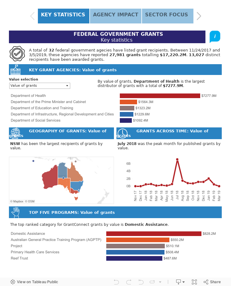
Using software – such as a Tableau ‘story’ – an interactive visualisation can be developed that can guide a user through three parts of the grants story.
We begin by summarising key insights – how many agencies are supporting grants, who they are, where they distribute, peak periods (with a big rush published in July after end of financial year) and the top programs. By providing the data to be viewed by number of grants and value, we enable the user to provide an overview that is meaningful to them.
And then we want to help the user to delve into insights by agency.
Selecting an agency enables the audience to find the key priority for each agency – by geography and grant categories. Recipients of grants can be displayed by filtering grant categories, enabling a user to find potential points of contacts for grant information or simply to get an understanding of competition in this space.
This part of the story can act as a way for individual agencies to communicate their individual impact – as well as support internal reporting requirements.
Finally, delving into insights from grant categories can enable the audience representing specific sector to find out what agencies are supporting work in their area, key grant programs for funding to date and the biggest players receiving grants.
This tool can act not only as a means of telling the story of grants, but also help organisations plan and prepare for bid as well as agencies to find current impacts and gaps. It can become many things to many people – and a powerful means of engaging with the public through education, support and analytics.

