
Through interactive visualisations, data is an avenue to educate, inform and influence a diverse audience. But to really succeed, it needs to communicate a compelling story to engage its users.
The art of creating compelling stories with data is not simply in the hands of data journalists who aim to bring insight to big data through journalism. Following standards of practice, all data – from human resource insights to demographics and policy impacts – can be better communicated.
1. Identify the elements of your story
In her presentation to the 5th annual Tapestry Conference in March 2017, data visualisation expert Cole Knaflic explained the fundamentals in formatting a story through data.
Traditionally, data is presented in four elements: a hypothesis to show what was asked, data showing what was looked at, an analysis showing what was done to the data and findings. But this formal can be stale and limited in its ability to engage an audience. In comparison, telling a story has five elements: a plot, rising action, climax or tension, falling action and an ending.
The aim is to create and maintain that tension.
The plot sets an overview of the story. In the case of an analysis of customer feedback, this could be showing an increase in feedback over time.
The rising action occurs when “layers are stripped back” to reveal more insights from the data, such as a decrease in passive customers and increase in promotors.
The climax shows a key point to communicate or issue. For example, increasing detractors in customer feedback.
The falling action can find an alternate view from the climax, or path to lessons. For example, detractors provide important insights into improving products and services.
The ending brings a resolution to the tensions, with proposed action and calls plans to resolve the climactic issue.
“I can use this same path for my data presentation and when I do it forces me to think about things not from my perspective alone, but from my audience’s perspective,” Knaflic explained.
2. Make a connection
Beyond simply the style, a story needs to resonate with its audience. Cheryl Phillips, Hearst Professional in Residence at Stanford University, explained to Tableau that storytelling makes an impact when it “makes a personal connection”.
“If you can find a personal connection in a vast amount of information, and then relate that to a person, they get it,” she said. “And all of a sudden, they remember it more effectively. And the same thing happens with visualisation.”
Interactive storytelling provides an opportunity to enable stories to be personal and relevant to a wide audience. Enabling options to drill into data – by geography, demography, industry and time – can allow stories to be insightful to more people.
It acts as a choose-your-own-adventure.
A story in data does not need a single narrative. Headline information should start the journey – but the users can guide the story from then on, creating a unique story of tension that engages them and communicates information at their level.
3. Apply context
A single data set may only tell part of the story. Telling an engaging, and informative, story may require looking at combining datasets to look at how it fits within the bigger picture.
For example, combining business data with census data can determine the demographics impacted – and where they are likely to be found.
Combining broad business and industry data can apply the business context.
And looking at what lies in an associated geographic region will provide spatial context.
It is an important element in explaining why your story needs is important to listen to and engage with.
4. Ensure the information is digestible
In designing an interactive visualisation, it is common to build a financial or performance style dashboard where multiple individual elements are place on a single page.
In telling a story, this format is to be avoided.
It is important in communicating a story that the information is easy to understand and interpret. And this will require data to be broken into themes or sections to guide the audience through the plot.
Think about your presentation as the pages of a story. Each page of the story can provide a new view or insight – even of the single data. And it can guide the user through and overview into deeper insights and a conclusion.
The key is to ensure each page does not overwhelm a user with choice and information. If the information is becoming too complex to communicate, it is time to open a new page on the story. Keep things simple. Complexity for the sake of complexity does not help a story and should be avoided.
5. Improving an existing visualisation
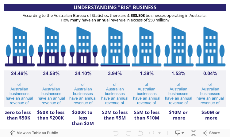
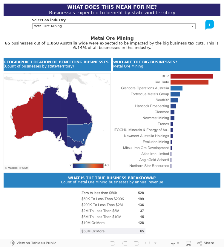
In March the Australian Broadcasting Corporation published a story which aimed to visualise every company to benefit from the proposed company tax cut in a single chart, prior to the legislation being dropped. The story provided access to data collated in businesses operating in Australia with an annual revenue of $50 million or more.
The result is a visually impressive interactive chart and a database to query – but neither provide a meaningful story to engage the audience.
So how can this be transformed into a data story?
First we can set a plot. Where do these businesses fit in the landscape of Australia’s businesses? By combining it with business data from the Australian Bureau of Statistics, we can see that these businesses make up a small proportion of the total business landscape.
Then we can add rising action by drilling data beyond the surface. Looking at the geographic data available we can see that the states of New South Wales and Victoria will be the biggest of economic gain that may come from a change in legislation.
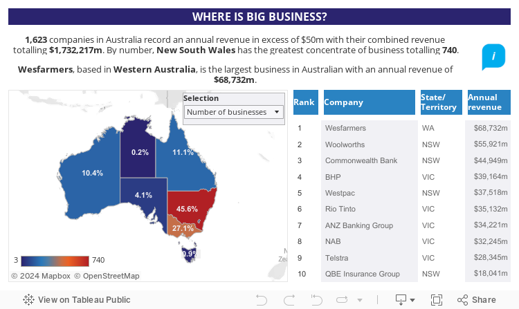
This is unsurprising. But comparing these statistics to other states and territories shows uneven economic wealth – the climax. As New South Wales and Victoria benefit, less than one per cent of the large businesses identified are headquartered in the Australian Capital Territory, Northern Territory and Tasmania.
In understanding this, we can look to other business opportunities in these areas – SMEs or businesses with a turnover of $10 million or less.
Finally, we can propose that additional government incentives can look to grow businesses in these regions ones with a $50 million plus turnover, to enhance employment and economic opportunities in these regions – our ending to the story.
But the story needs to go further to create a connection with the audience. Allowing them to drill into the story by geography and industry of business lets them determine how they may be impacted – either by location or the area in which they work.
The story may change slightly to be meaningful to them, but overall the fact that there are likely to be limited benefit to them in the overall picture will remain true – and it succeeds in making a greater impact by being meaningful.

