
Giving staff wide access to industrial level data visualisation and analytics tools is a powerful way to expose opportunities for agency innovation and to empower a new organisational culture that embraces data and a strong outcomes focus.
Business intelligence done right can serve a multitude of purposes and needs within an organisation – from aligning executive leadership, to organisation workforce planning, to policy development, to reporting organisational expenditure and impact.
But the real power of modern analytical visualisation tools is as a device for shifting organisational culture to one built around performance and measured changes in program outcomes.
In Tableau’s experience business intelligence capability should be not sit with a small number of highly specialised data experts. The availability of software needs to go hand in hand with the shifts in organisational culture to ensure universal accessibility to data and reporting for anyone who wants it.
Letting many staff work with easy-to-use visualisation and business intelligence, builds confidence and capability around data analytics, while focussing efforts around the key performance outcomes and opening opportunities for policy innovation based on insights from the visualisations.
The challenges of organisational reporting
It can be hard for an agency to transition away from reporting processes that seem to meet existing needs. Resistance can come from anyone within the organisation but especially from the staff who are directly impacted by the change.
Traditional monthly reports formatted as a static documents are often considered to be easy for staff to deliver in a way that meets the needs of key internal and external stakeholders. But are they really?
When it comes to reporting, the old adage that familiarity breeds contempt is appropriate. Exposure to the same static document month after month will have less impact over time.
So making the assumption that analytical needs will be the same on a monthly basis is bad business.
Embracing interactive and engaging reporting that enables them to drive analytics will not only maintain the interest of stakeholders through projects and campaigns, but also better meet organisational needs.
It also simplifies the process of developing reports. Rather than constantly creating new reports, an interactive report delivered via business intelligence software can be updated with new data monthly.
This also allows for greater reporting capabilities and features unavailable to static reports such as time series analytics, which visualise temporal effects.
And the benefits go further. Business intelligence opens the door for more business areas to drill into information relevant to their specific needs and functions.
Building smart reporting tools
Providing interactive reports through business intelligence tools — desktop or web based — requires reports to be built smart. This means moving beyond the image of a finance dashboard commonly associated with interactive reporting.
Using industrial level software, information can be visualised as tables, graphs, charts, images and dynamic text. It can be stylised to be consistent with existing brand colours and fonts.
It also meets the needs of corporate reporting, allowing users to directly generate reporting outputs from a business intelligence interface. Limiting the need to copy data to another reporting tool also minimises risks of misreporting data.
A practical example
It is one thing to explain why it is important to enable organisation-wide reporting, but it is another to show how.
Take mobile phone black spots. For the Federal Government’s Department of Communications and the Arts, this is a key dataset that can influence programs, policy and spending. It is also part of the agency’s reporting to its Minister and other external stakeholders, and is a common source of questioning from politicians.
Reports are commonly accessed as site lists and summary documents. These conservative reports provide limited analytical insights.
Delivering the information with interactive selections and for various reporting breakdowns drive better reporting overall.
A national summary can identify hotspots of issues and allow users to select communication challenges such as black spots and limited mobile coverage. Bringing in details on population, hotspots can be determined by a count of identified issues or population affected.
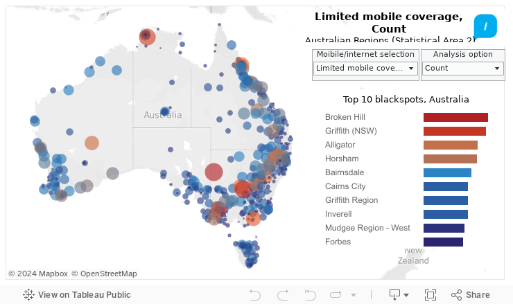
Capable of reporting by state, the agency has a deeper insight into the collective data while providing a greater picture of regional issues.
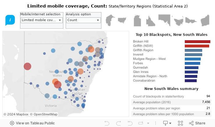
Drilling down even further pinpoints localised challenges, facilitating the identification and development of solutions of these challenges.
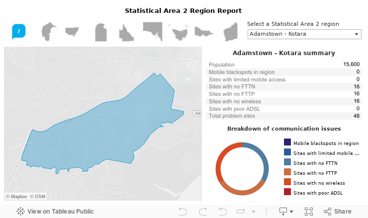
Visually appealing, these interactive tools can be shared as links, images or PDFs to support reporting and communication requirements.
What do you need to succeed?
It is not new capabilities and processes that will lead to success but an ongoing journey of centered around people.
The cultural shift required to support wide use of business intelligence and reporting needs to be aimed towards self-service analytics.
For some, such a dramatic shift that can lead to resistance. Tableau’s Director of Market Intelligence, Josh Parenteau, recently explained that this fear comes from a lack of understanding. But it is also important to recognise and respond to these problems.
“While the risks and resistance of change management can be mitigated with education, planning, and responsiveness, it’s critical to understand how to apply these processes in an agile approach to modern analytics,” he said. “This means placing people over process, throwing away all-or-nothing milestones, and embracing incremental improvements to deployment plans and governance.”
Tableau’s business intelligence tools support the agile delivery of technology, allowing an iterative approach to the implementation of a massive culture shift, building knowledge and confidence over time.
Specialist skills required to develop and implement improved reporting through business intelligence software likely exist already.
Data custodians can manage, deliver and prepare data.
Policy makers and executives can identify the information and reports need.
Communications staff can explain the external demands for information.
And graphic design teams can ensure they are designed to meet corporate standards and are visually engaging.
Getting started
The important part of getting started is – simply get started. Get the right software for the job and identify key datasets that provide reporting value to executives within the organisation, one or more business areas and external stakeholders.
Engage with key communication areas to understand style and standards.
And build beta reporting tools that will begin your organisation on its journey.
The tools won’t be right the first time. But getting it out for feedback and engagement is part of its iterative design that can be improved over time. And the more these reporting tools are seen, the more their value is communicated to inspire an enterprise-wide data-culture.

